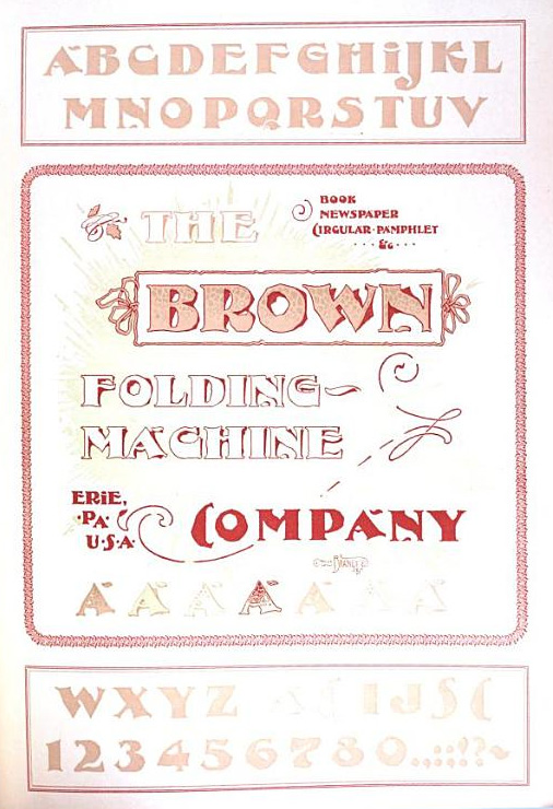
Downing
G. Fonts Designed by Will H. Bradley
G 1. Bradley, Will H. ‘Downing,’ typeface design, 1891.

Downing is a typeface Will Bradley drew for the Brown Folding Machine Company, f.a. Inland Printer, December, 1891. Specimens within the color ad insert show solid, outline and spotted two-color-fill versions. Font never cast.
“By reference to the handsome colored insert of the Brown Folding Machine Company in this issue our readers will have forcibly brought to their attention the fact that original designs in typefaces have not been brought out first entirely by the typefounder, but that the artist in pen work can make suggestions very often that others may learn from. The letter presented in this page is original, although at first glance similarity in form to other faces now on the market may strike one as being present. Upon closer examination, however, the letter will be found to have character entirely its own. The possibilities of this letter when printed in combination are seen by careful study of the page, although but few of the many ways it can be used are shown. It will be noticed that the letter, which we have named the ‘Downing,’ is capable of use either in the solid or open series, independently, with equally good results. It is designed by Will H. Bradley, of Chicago. With two kinds of I’s, T’s, C’s and S’s an oddity in setting lines can readily be secured, and the stiff character of many type lines be entirely avoided. The Inland Printer takes pleasure in presenting this production, which has been designed especially for this publication, and asks that typefounders or others desiring to bring out the series in type, first communicate with us in reference to same, as the design is copyrighted.”
Ref: The Inland Printer, vol. 9 (Dec 1891), 272; Bambace, page 132.

Citation: Lindsay, Martin S. Downing. Website: WillBradley.com. Accessed 15 May 2026, <https://willbradley.com/work/typography/downing/>. Bibliography. References.
Contact. Legal. Privacy. Design. Copyright ©1994-2026 by Martin S. Lindsay.