Bradley Series
G. Fonts Designed by Will H. Bradley

G3. Bradley, Will H. Bradley Series, typeface design, 1894.
Drawn as part of the cover design for the 1894 Christmas number of Inland Printer. Bradley licensed his design to American Type Founders, who tasked Herman Ihlenburg at MacKellar, Smiths, & Jordan (the Philadelphia branch of ATF) to design and cut the complete font.
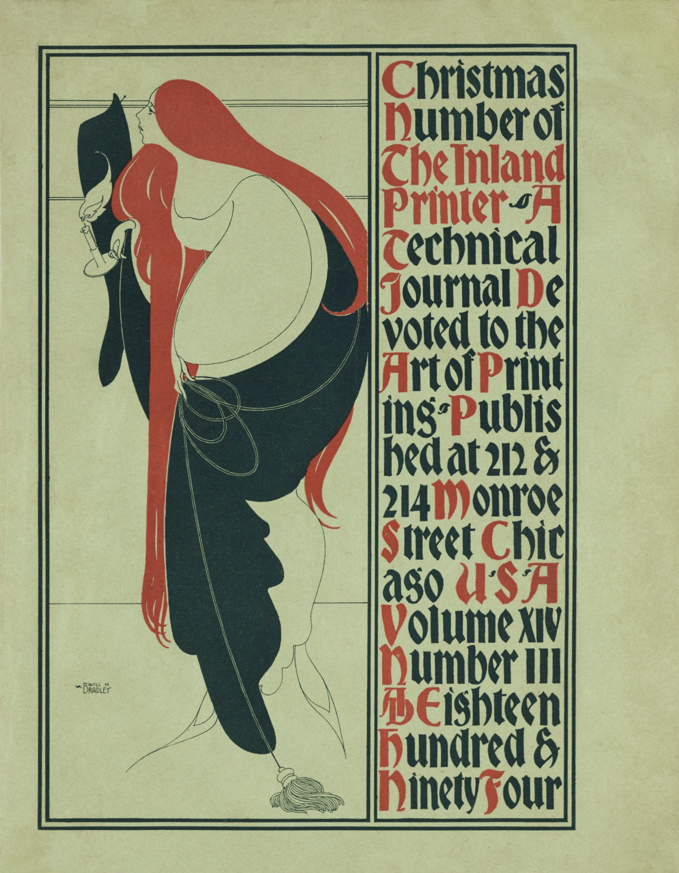
The Inspiration for ‘St. John,’ ‘Bradley Series,’ and ‘Abbey Text’ typefaces was the December, 1894 Inland Printer cover illustration by Will H. Bradley, Image, Collection of The Detroit Institute of Arts
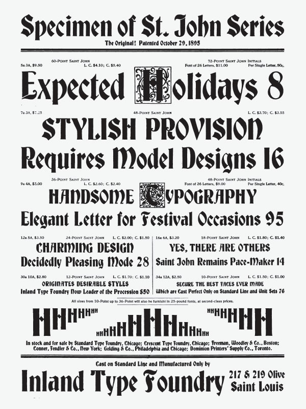
Inland Type Foundry beat everyone to market with their own version of Bradley’s lettering, ‘St. John,’ in August 1895. William Schraubstadter’s design was patented Oct 29, 1895, #24,806. They later claimed to originate the design, and described the other typefaces as imitations.
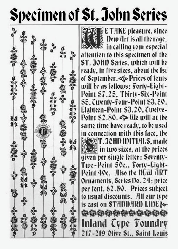
Inland Printer, vol 15 (Aug 1895), 505.
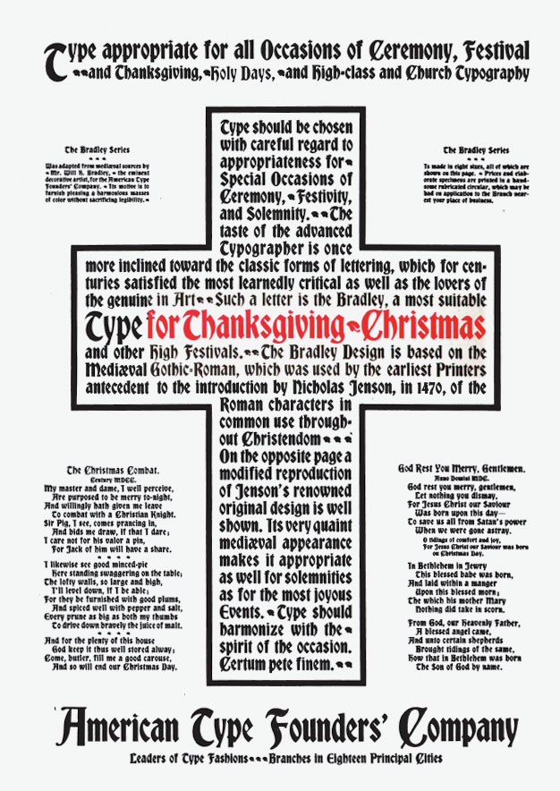
The ATF ‘Bradley Series’ was introduced in October 1895, as having been adapted “from mediæval sources by Mr. Will H. Bradley, the eminent decorative artist.”
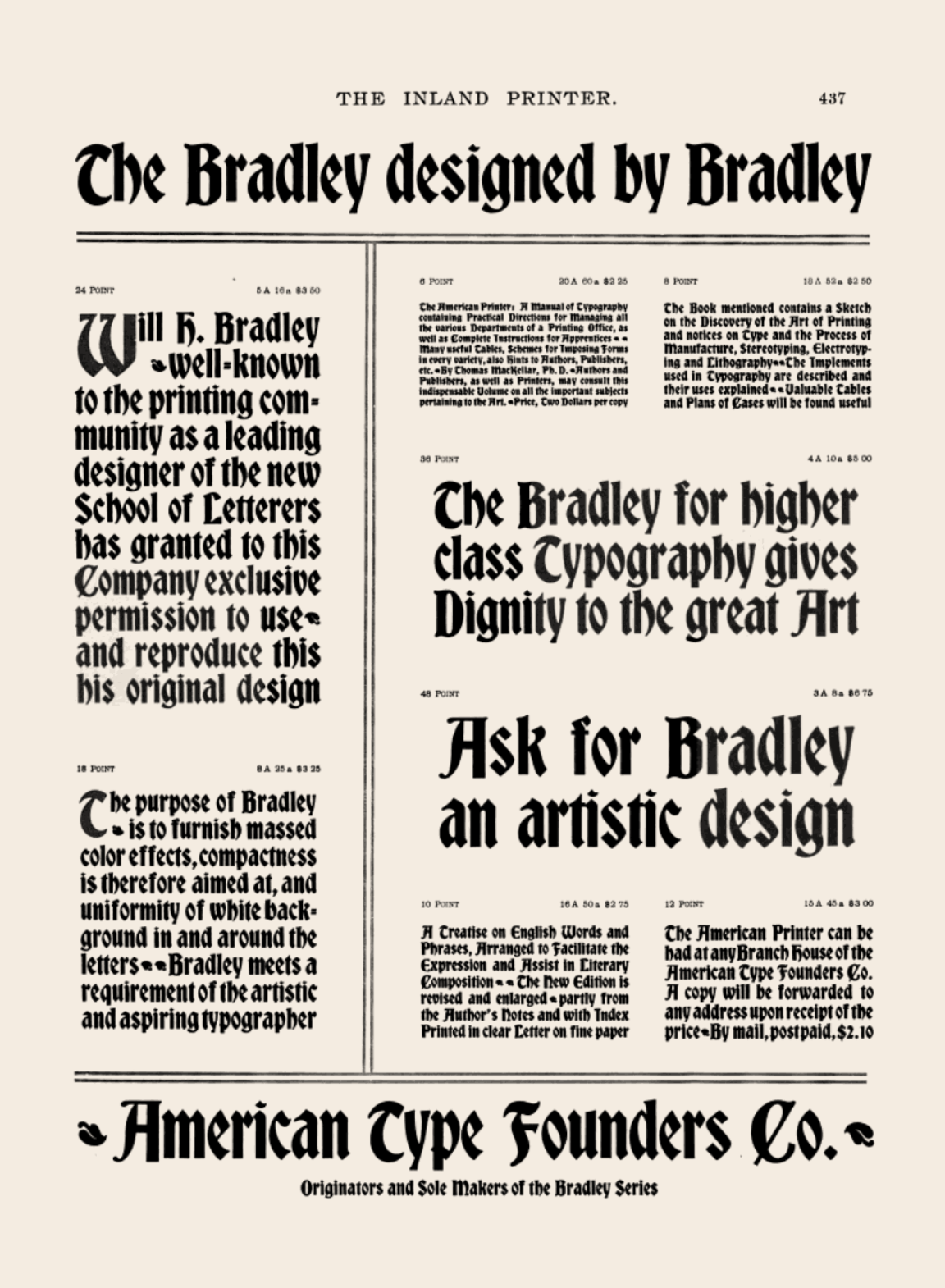
Inland Printer, vol 16 (Oct 1895), 4pp insert, 437-441.
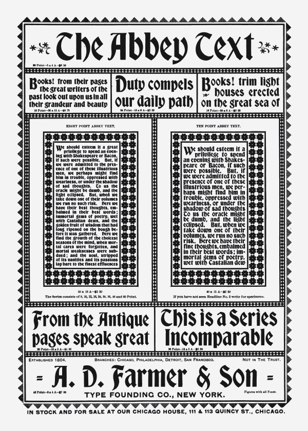
At the same time, however, A.D. Farmer & Son Type Founding Co. introduced their knock-off called ‘Abbey Text.’ Ironically, advertisements for both appeared side-by-side in the same issue of Inland Printer.
“Last month I wrote in praise of the new face ‘St. John,’ by the Inland Typefoundry, early specimens of which appeared in The Inland Printer for August. In the following issue I now find two faces, ‘Bradley’ by MacKellar and ‘Abbey Text’ by Farmer & Son, bearing an exceedingly close resemblance to the St. John. It is not the first time that I have noticed a curious coincidence of the kind – two or more houses coming out almost simultaneously with novelties almost identical in their main features. It would be invidious in this case to compare these three faces, favorably or otherwise, with each other. They resemble each other so nearly that a printer having one face in stock would do well to avoid the others to prevent confusion, yet the personal characteristics of the several designers have given each letter a character of its own. The most complete series is the ‘Bradley,’ named after its designer, and shown in eight sizes, 6-point to 48-point, and I have no doubt that, as letters of this class are characteristic of Mr. Bradley’s work, that to him may be assigned the credit of originating the design, of which the two other faces appear to be variants. Apart from its wide range of size, the ‘Bradley’ is distinguished by a certain quaint rudeness of form, suggestive of the old Caxton types, and on this account is the most appropriate for old-style work. “Abbey Text” is in seven sizes, 12-point to 60-point, and has a sharper and cleaner cut and more modern face, while the ‘St. John,’ to which I referred in pretty full detail a month ago, is even more modernized, and as legible as roman – in fact, would not appear out of place associated with modern types.”
The Hamilton Co. later issued the design in wood-type with permission from the ATF.
The Bradley Series was soon after copied by many other foundries in America and abroad.
Inland Printer, vol 16 (Nov 1895), 89.
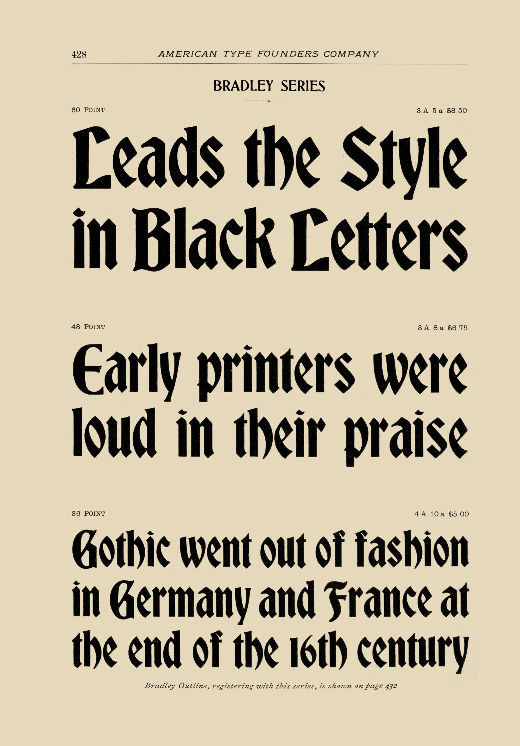
60pt, 48pt, and 36pt-sized specimens of ‘Bradley Series’ typeface. Desk Book of Type, ATF 1899, 428.
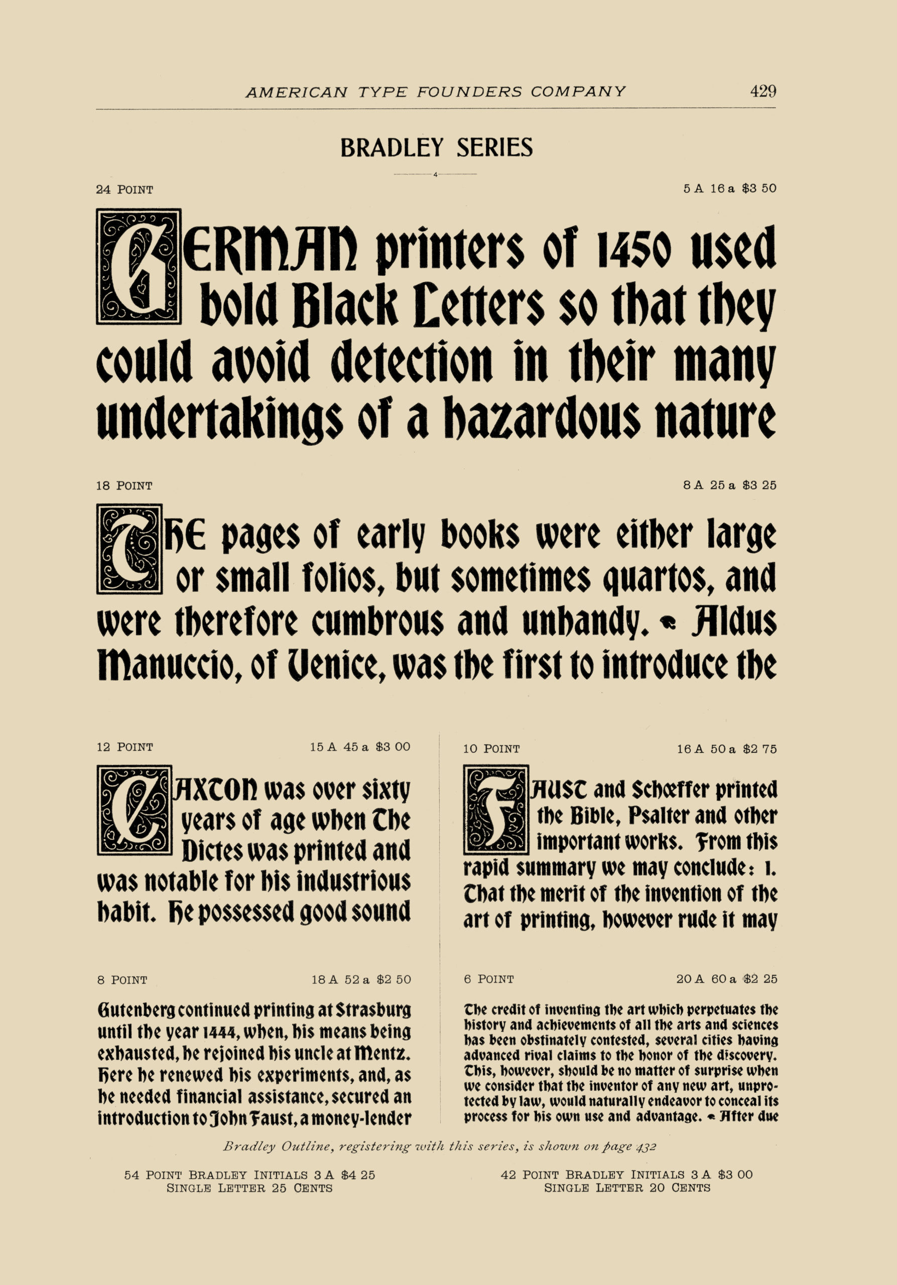
Specimens of ‘Bradley Series’ typeface with ‘Bradley Initials.’ Desk Book of Type, ATF 1899, 429.
Citation: Lindsay, Martin S. Bradley Series. Website: WillBradley.com. Accessed 12 Jul 2026, <https://willbradley.com/work/typography/bradley-series/>. Bibliography. References.
Contact. Legal. Privacy. Design. Copyright ©1994-2026 by Martin S. Lindsay.